SeaDataHub Global Maritime Reporting
A report within reach of the App
Introducing SeaDataHub, the innovative application from Carnival Corporation. Our team was proud to design its intuitive user experience (UX) and eye-catching user interface (UI).
Client
- Carnival Corporation
Year
2022
Industry
- Technology
Partner
Day One S.r.l.
Giorgio Barroccu
Chiara Claus
Category
UX/UI Design
Tag
App Design, Creative Direction, Functional Analysis, Project Management,
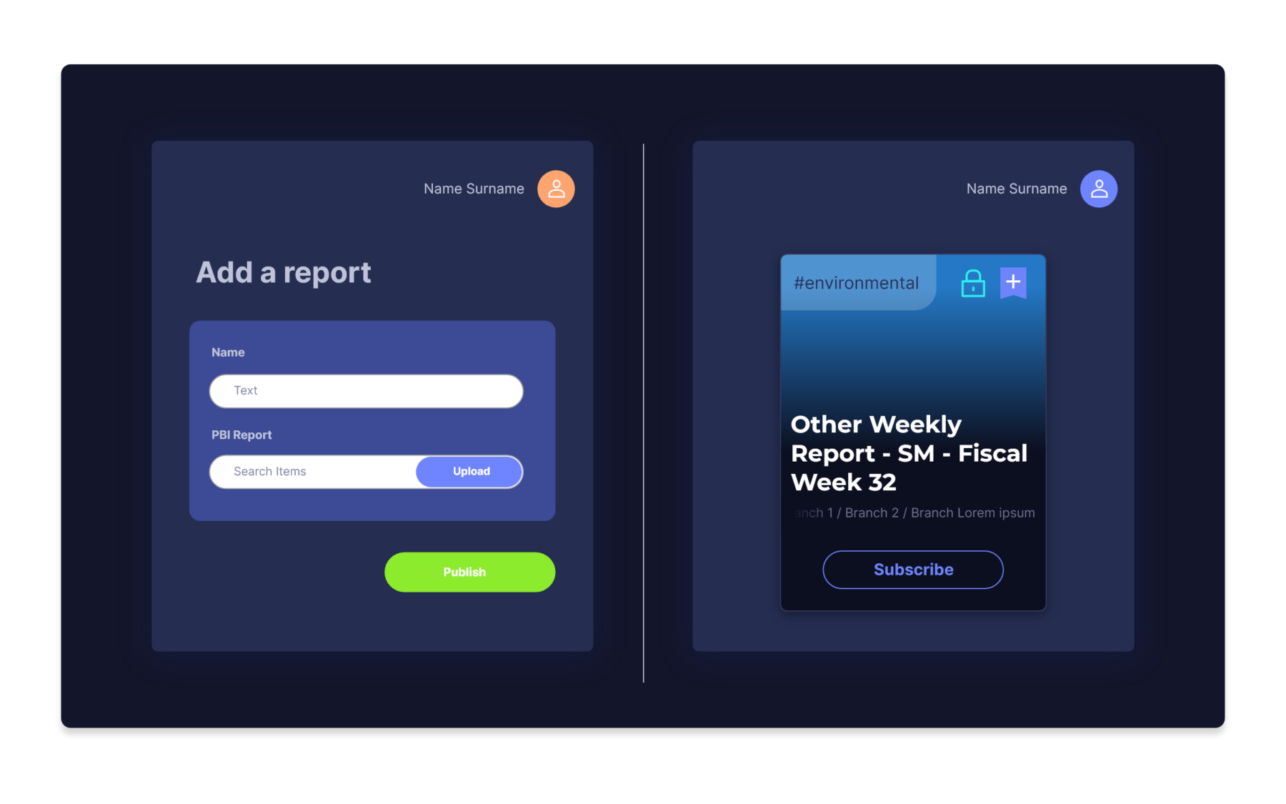
SeaDataHub is managed autonomously, with two fundamental roles: the publisher – who creates and publishes reports, and the portal user, who views the catalog and requests access to brands, reports, or content area of interest.
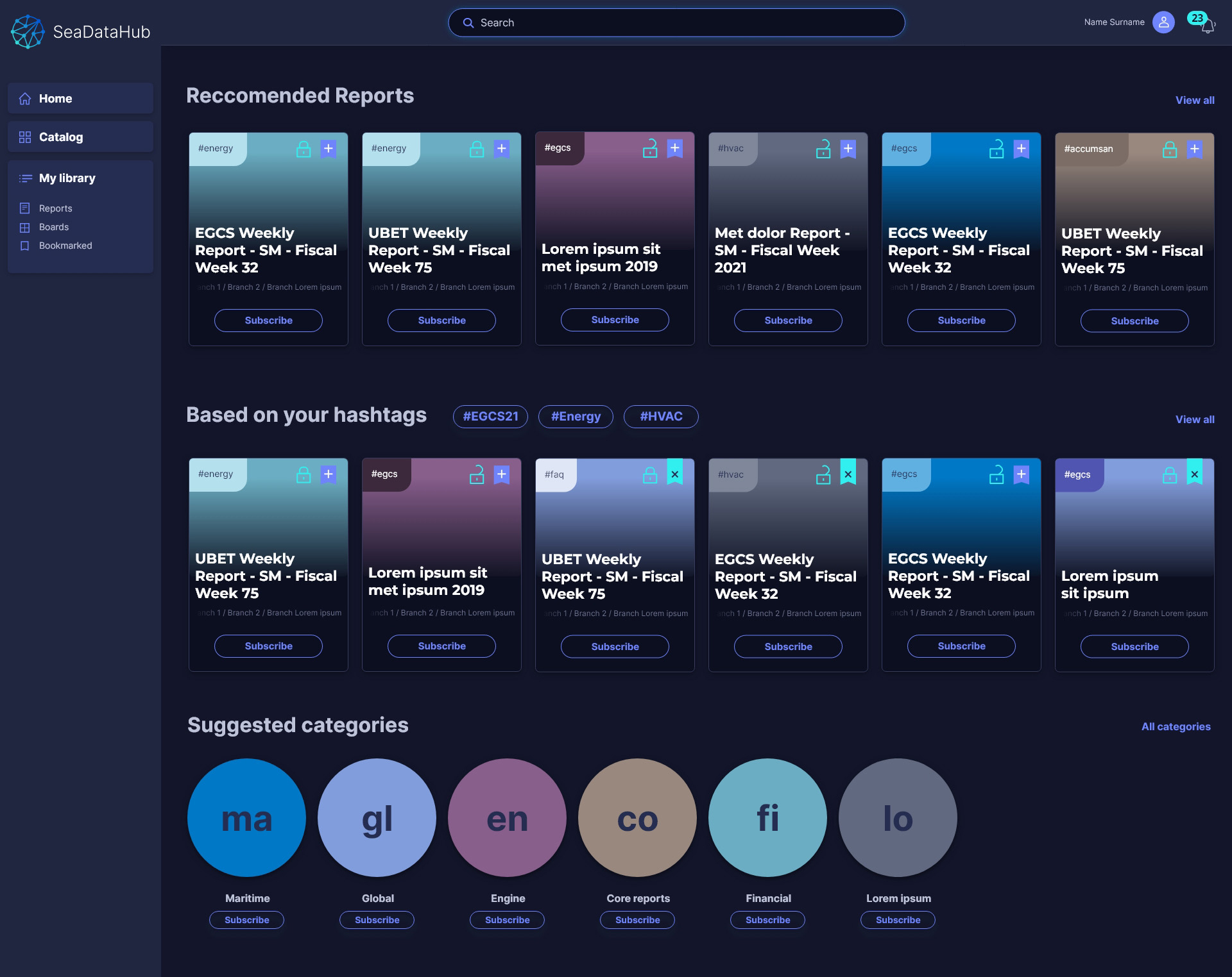
The reports chosen by the user are made available in a Mylibrary section and organized in customizable collections that are updated when a new report arrives.
The challenge
We accepted Carnival’s challenge to reach their goal with our support: to inform and connect the entire organization in a more efficient and simple way, with a fully responsive and mobile-ready web app.
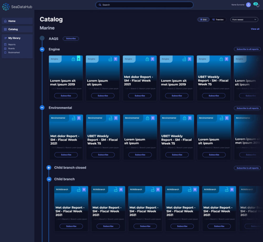
The platform delivers on several promises allows a deeply granular search, helps to overcome the paradox of choice, clearly distinguishes each report without requiring excessive effort, and its design that makes the experience easy and entertaining from both desktop and mobile devices.
How we faced it
We started from a careful analysis of the apps on the market. Platforms like Netflix and Prime Video tend to rely on movie and series suggestions, while apps with a focus on books and music like Books and Spotify leave more room to the user for action: they have a left column with menus, and the search function is the first field in top left.
Booking/purchase portals, on the other hand, have a single purpose and therefore the starting point is a direct question that pushes a search.
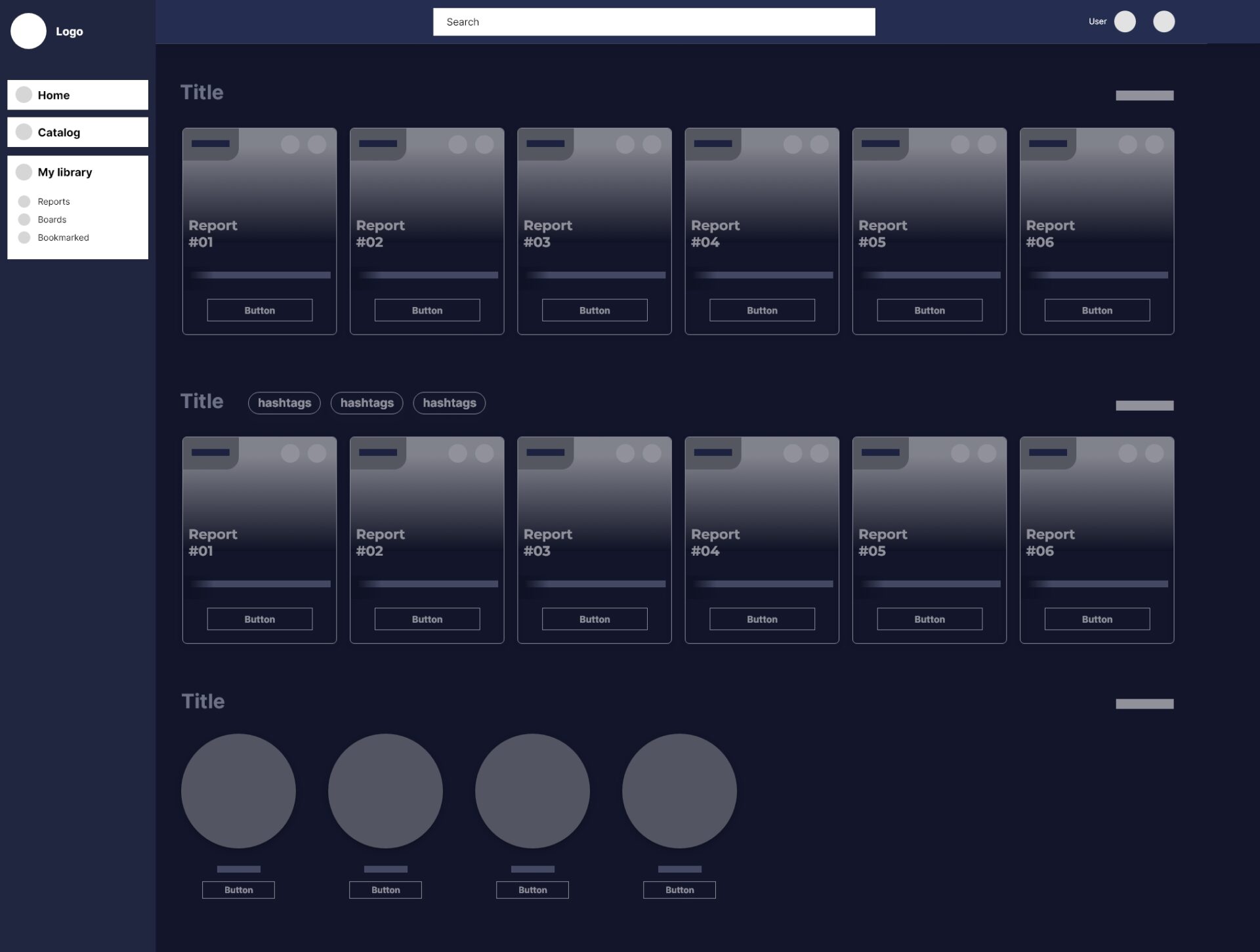
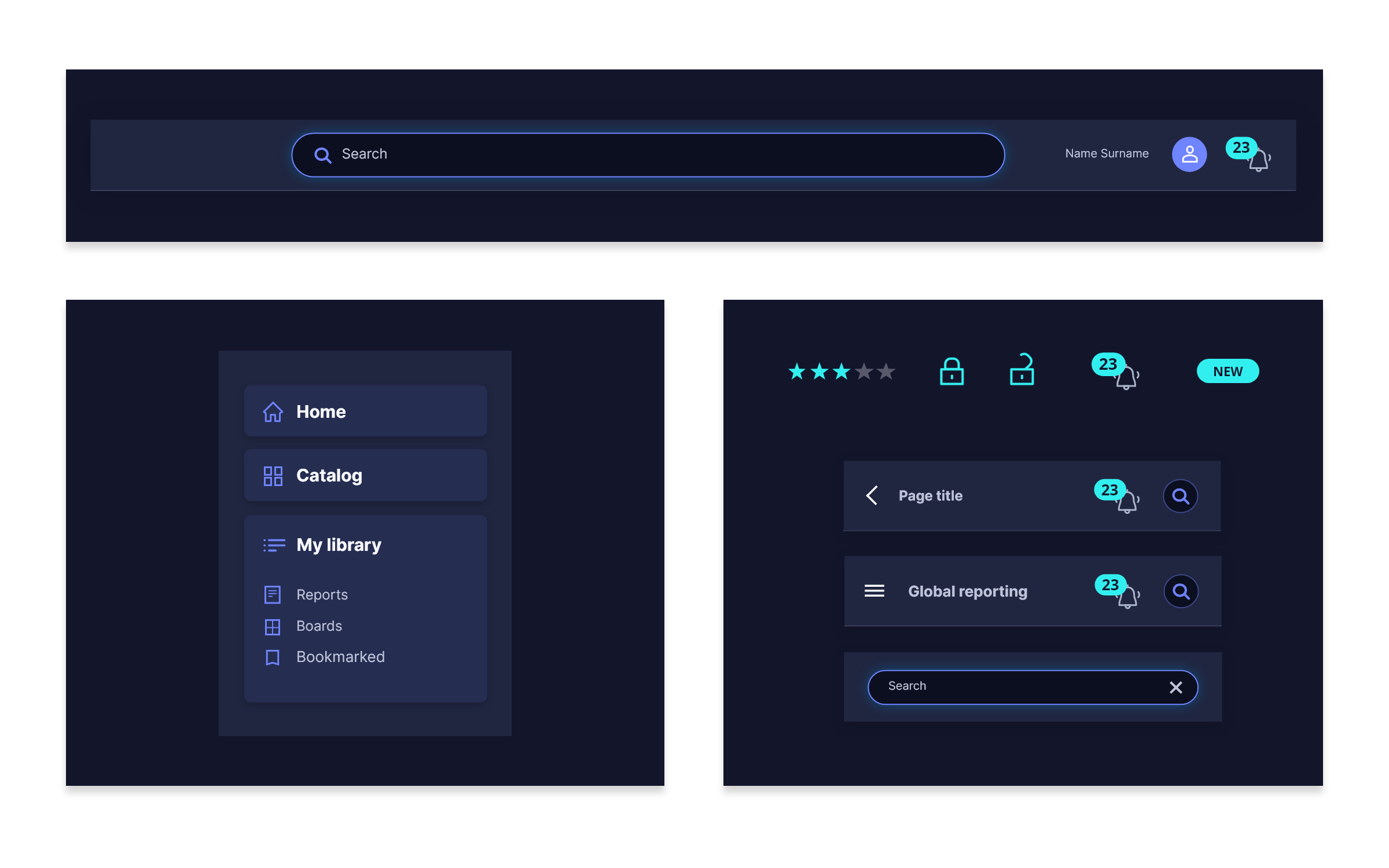
At Graphic User Interface level, we have kept the brand identity elements unchanged: the font, the colors and the layout with sidebar and header. The sidebar has been moved to the left, becoming the real portal menu and no longer just a “service bar” for searching.
The header, on the other hand, keeps the user and notification positions unchanged, making login/logout and any personal settings familiar, but adding the search bar as a primary element and as a starting point of the workflow. We chose a dark background to help enhance the images by focusing attention on important content.
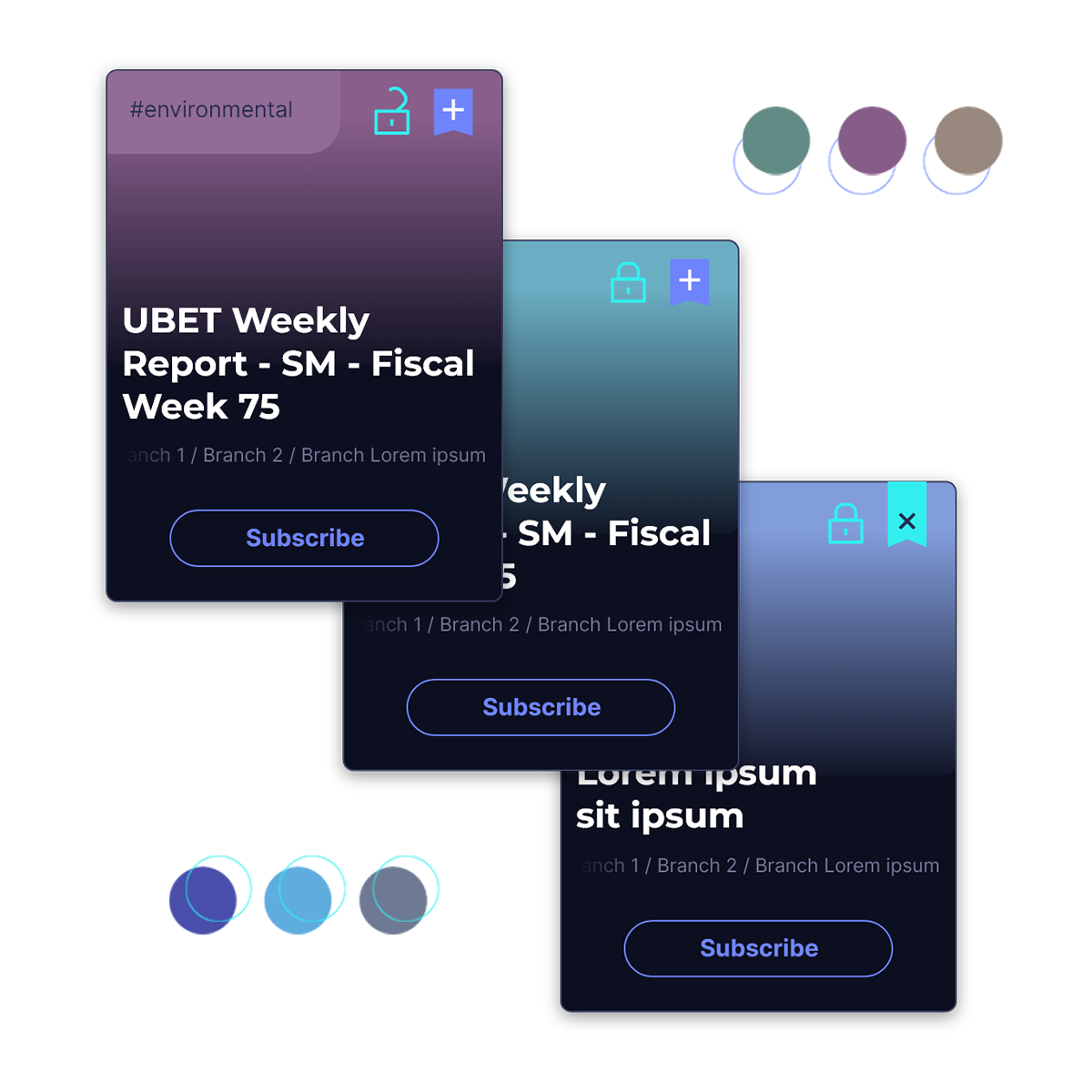
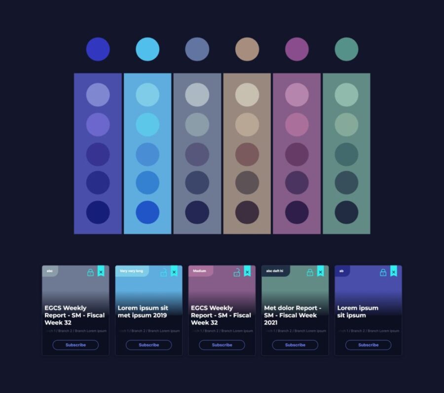
All the platforms we analyzed have a strong graphic impact: the cover images of the items, whether they are films, books or musical content, tend to be overly homogeneous. In our case, an excessive graphic alignment of the contents would have been counterproductive, each report had to be clearly distinguishable.
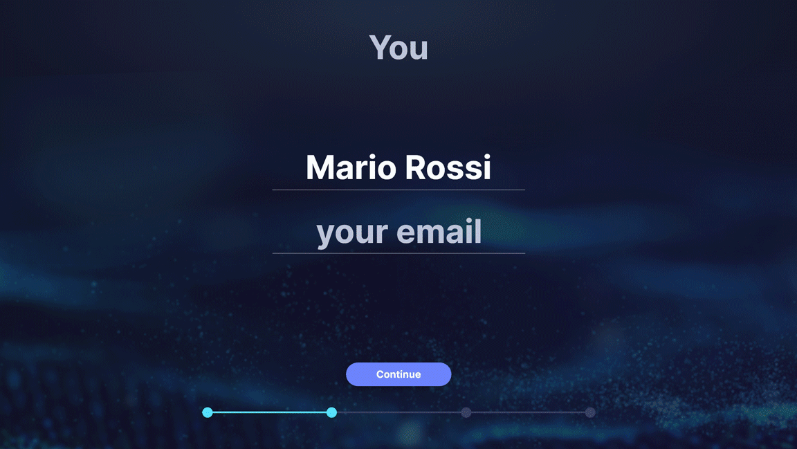
SeaDataHub is intuitive from the very first approach starting from the Welcome Wizard, a guided procedure that allows the user to perform complex actions and get to know the application. This way he can “learn by doing” the key concepts and functionalities of SeaDataHub.
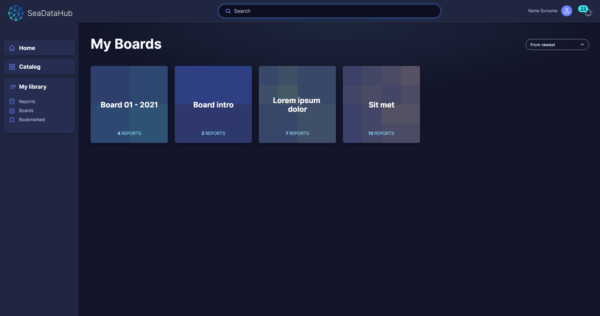
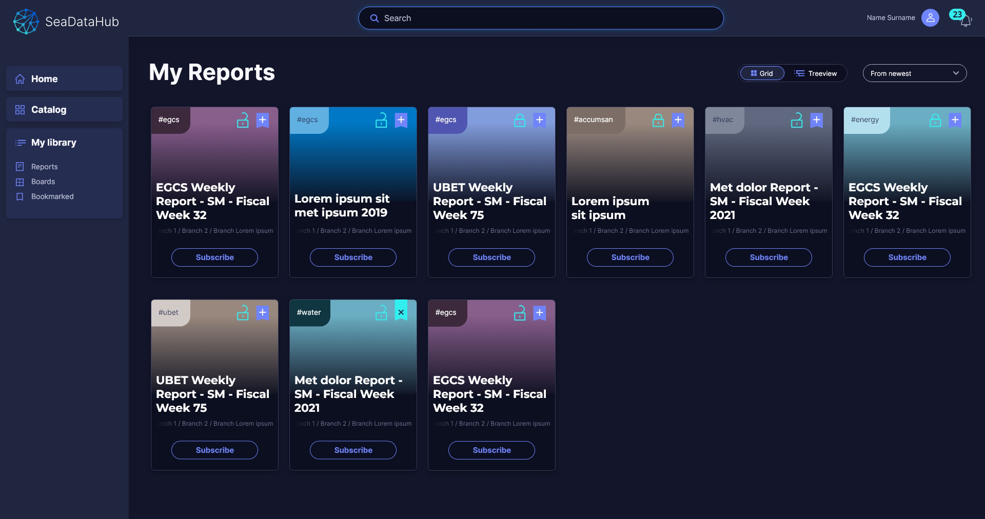
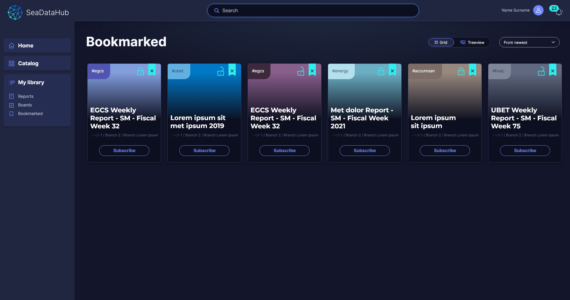
The home is a tailor-made suit, made to measure for each person: in the MyLibrary section he will find all the reports he has subscribed, while in the Favorites section he can save the reports of interest, with or without subscription, and organize them in boards. He will also be able to follow other users, Publishers or Authors.
This function, typically derived from social networks, combined with the high creative delta (thanks to the use of hashtags and the choice of colors), will encourage authors to create increasingly high-quality content in order to obtain visibility and recognition during review and voting.